


5 Common Yet Lethal Mistakes to Avoid For Mockups
Do you know 50% of the app budget is spent on app design? Yes, you have read it right. Miscommunications, product incompatibility, improper specifications are some of the common yet lethal issues that can take your application development down. But here the good news is that it can be avoided using the mockups. It is a great way to represent your app idea. There is no denying in the truth that it is very tempting to skip the mockup phase, especially when you know it is in fact the most integral part of the process. The mockup is required for application as well as website design. Keep reading to delve more about it.
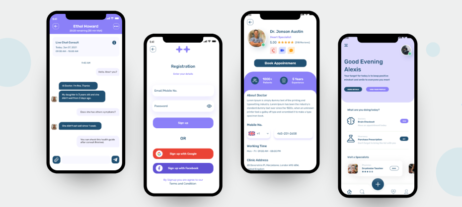
What is a mockup?
There are several aspects to consider when developing a mobile app and one such important aspect is app mockup. In the app industry, a mockup is used for promotion, evaluation, and demonstration. Mockup's important functionality includes presenting basic functionality of the app, mid to high-fidelity representation of the app, along with the visual representation using colors, typography, photos, icons, etc.

Both wireframe and mockup are similar in many ways, but mockups sometimes are described as the decorated versions of the wireframe. The truth about the mockups is also that they can make or break the impression.
How to do mockup?
Several factors are responsible for the mockup design. Keep reading to discover these important factors:
● Typography
It is the key ingredient that possesses the power to change the mood and look of the application. Fonts should match with the theme and style of the project, any font cannot go with any project. You can use Google Font to find new fonts as most of the time it is freely available to use in your websites and apps.
Your chosen font should be able to bring out the right feeling of the website. You can also consider using complementary fonts to create a visual hierarchy and separate different headings and subheadings.
● WhiteSpace
WhiteSpace may seem nothing, with the proper use, you can save your project from turning into a mess. Also known as negative space, it helps to attract the user's attention and helps to build relationships between different objects. Consistent use of white space can do magic on the screen.
● Color Palette
Colors possess the power to evoke emotions. With the right stroke of color on the screen, you can hold the attention of users. When developing the mockup screen, make sure to use it sparingly and purposefully. Here comes a quick tip, when doing a mockup for an app, limit the usage of the color palette with one or two colors.
Advantages of mockups:
- It helps to find out the clashing visual elements in the design and helps to develop an eye-appealing visual design. You get a chance to point out the fault at the early stages to avoid any pitfalls during the development stage.
- From the usability point of view, it allows testing visual details much in advance before committing it to code.
- As a part of the front-end development team, you are in a constant search to alter the design for better results. The high-fidelity mindset helps to design and make decisions from the user's point of view and boosts the chance for app success.
- It further helps to improve collaboration and communication with the app developers. With it, developers can add-on some valuable suggestions to understand what exactly the product looks like after the actual completion of the task.
Get in touch with us for your requirment.
Some common yet lethal mistakes to avoid for mockups:
After knowing the importance and benefits of app mockup, now we will discuss some common yet lethal mistakes that can cost you a project or projects maybe.

- 1. All screens are not taken seriously
- One of the biggest mistakes is leaving out all screens, thinking that it is just a screen as sometimes it can cost the loss of a project. A mockup is supposed to the representative of every screen that will be the part of your app. Even if your mockup misses out on a single screen, mockup is considered as incomplete.
- When we say every screen we mean even a popup screen after the registration, reset password screen, and every small or big functionality screen. If you might be missing a few screens when doing mockups by yourself, but when a professional does the mockup they include every single screen even the smallest features like terms & conditions, confirmation screen, etc.
- 2. Lost buttons that end up nowhere
- Anything that is not part of the app should not be part of the mock-up. Even an unnecessary button on the screen can ruin your impression in front of the client. Every button and screen should be logically connected.
- 3. Too much reliability on large videos and images
- During the mockup, you might tempt to fill the application with countless large videos and images. The major problem with large videos and images is that they eat up a large chunk of bandwidth which puts an unnecessary burden on servers and hence leads to unhappy users’ experience.
- 4. Screens with no exist
- An ideal mockup should have an exit option if it has an open option. There has to be a button to leave the screen if there is a specific feature screen. You can’t simply leave the screen without clearly indicating the navigation. This might be a very minor thing, but it can prove to be a lethal responsive mockup mistake from the designer’s side.
- 5. Missing to number pages
- Numbering pages might be a minor thing, it can keep your mockup in a logical and organized way. The screen should be numbered in a sequence that is representative of the user's behavior. It should be numbered in a way that you want your users to see. But while sequencing the mockup, ensure to avoid any confusion and blunder. A simple way is an effective way to give a better understanding of the mockup apps.
- 6. Lack of consistency
- People appreciate messy art, but only on canvas. Your app’s page needs to be consistent in terms of content and overall functionality of the app. Moreover, font size, color, screen resolution aspect should be consistent from page to page. Lack of consistency is a deep pitfall.
Need professional help?
Always remember that you can anytime take the help of a professional designer. Team up with the web design company Ahmedabad to turn chances into a big YES! We hope you can overcome the chances of failure by avoiding the above-discussed pitfalls. Don’t rush, just go screen-by-screen mockup to avoid any confusion and get clarity about the ultimate result.
